25 October 2009

Insanity and Bane of My Life

This project was the insanity and bane of my life. I should have taken pictures of the work in progress to show how insane I was. I was considering suicide. O.O It was really bad.

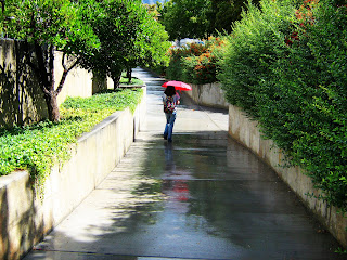
Ok here is the photo I took and use for this project.
I call it Red Umbrella.
very nice right?

Seven hours later, after doing 900 cuts and gluing 300 pieces back together I come up with this...
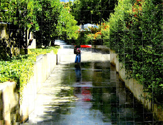


I was about to cry...
It don't change that much.

I was really worried if my teacher would like it because I had spent so make time on it and worked so hard and was getting head aches just by thinking about the grid I drew on the back of the 20x15 photo so I would know what I would be gluing back together and what to through in the trash and it has the nerve to come out look the same as the original photo.
(play smallest violin in the world and cry out the oceans.)

I got to say my day was made when I got it back and the teacher had given me full marks plus bonus points! (woot! do a dance! :D ) My teacher said that my work was a perfect example of how the mind takes information and finds "closure," which was a concept that we had been discussing in class but didn't really have an example for. claps for me!!! ^^

Color concept

Ok, here are some pieces from my 2D design class.
This first one is using the color concept that a color will change based on it's surrounding colors.
Notice the two small squares in the dark and light green blocks look the same color. The bottom two strips of color are what the two small square colors really are. Really fun how we can trick the mind and make it think it's one color when in reality it's two! :D


Sadly this one didn't work out so well. This one is like the green one above only in stead of making two colors look like the same color here I'm trying to make one color look like two colors. You can kinda see it... but yeah. :P


This assignment was fun!!! My job is to put two colors together that are "contrasting colors." Meaning if you look at it too long your eyes should hurt and you get a head ache. I don't know how well it does it on a computer screen but when I look at it in real life it really does hurt my eyes.


Ok, this is... I forget what the concept is called... but any way. What this one should do is that the two colors should mix and make a third one. Once again I don't know how well it does looking at it on a computer screne, but in really life if you stand back from it and look the smaller pieces in the middle mix to make gray when they are really tan and light blue.


This was a fun assignment. I am to use the same colors in all three pieces but arrange it differently each time to make each picture look different. I had fun using contrasting colors and giving people head aches so I did that again here. Since I did used contrasting colors and pointed it out when I turned it in my teacher gave me some bonus points! ^^


Love you all! ^^

01 October 2009

ipop

Check out my "ipop" piece I did for The Sketch Blog. Click here.

Mapping Art

Drawing Class:

Here I had to map out a drawing and make an exact duplicate... hence the construction lines.
Pencil on Bristal Paper.

Color Aid, Transparencey

2D-Design class:

They are not transparent: they are seven different colors.
Color Aid on Stonehenge Paper

Pen and Ink, Line Art, Contour drawings.

One man's junk is another man's treasure.
One girl's insanity is another girl's art!

Unfortunately there is nothing insane about me. :)
I am just a college student, studying Fine Art Illustration at Brigham Young University in Provo Utah.

I will be posting my art as I get them back from my professors. I'll also post art that I do for fun.

My Drawing Class:

These are my first assignment project for my drawing class.
Each one had a word prompt... and this is what I came up with.
Lets see if you can match the pictures with their prompts.
The Prompts are:
  • Interior
  • Small
  • Huge
  • Private
  • Complex
  • Hot